MLB Radar Charts - UX/UI
MLB Radar Charts - UX/UI Design
Problem
Baseball enthusiasts lack a visually intuitive and user-friendly app that allows them to quickly assess and compare player skill and performance across statistical categories. This hinders their ability to engage in informed discussions and make data-informed evaluations of Major League Baseball players.
Solution
MLB Radar Charts is a mobile application that transforms complex baseball statistics into visually striking and easily interpretable radar charts. This app enables baseball fans to:
View a player's performance across various metrics, and timeframes, using percentile rankings.
Gain context for a player's skills relative to their peers.
Create visually appealing, information-rich screenshots for online discussions.
Learn about modern baseball statistics and how these stats translate into on-field baseball skills.
My Role - MLB Radar Charts is a hypothetical mobile app created solely by me that showcases my ability to address user needs, conduct research, and design innovative visual solutions.
Competitive Analysis
Evaluating key features, user experience, data visualization methods, and statistical offerings of key competitors to inform the development of MLB Radar Charts and ensure it provides unique value to baseball fans.
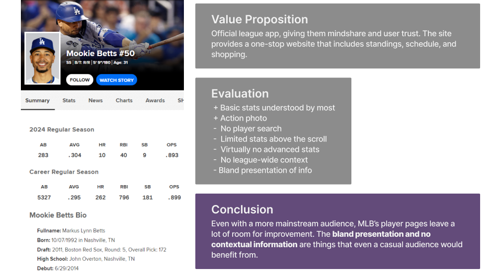
Competitor #1: MLB App
Competitor #2: Baseball Savant

Competitive Analysis Takeaways
There is room in the market for a baseball stats app that is visually appealing and also contextualizes advanced baseball statistics in a way that is friendly to a broad baseball audience.
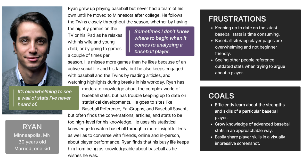
Persona
A detailed representation of our target user, based on user research and interviews, to ensure design decisions are user-centered.
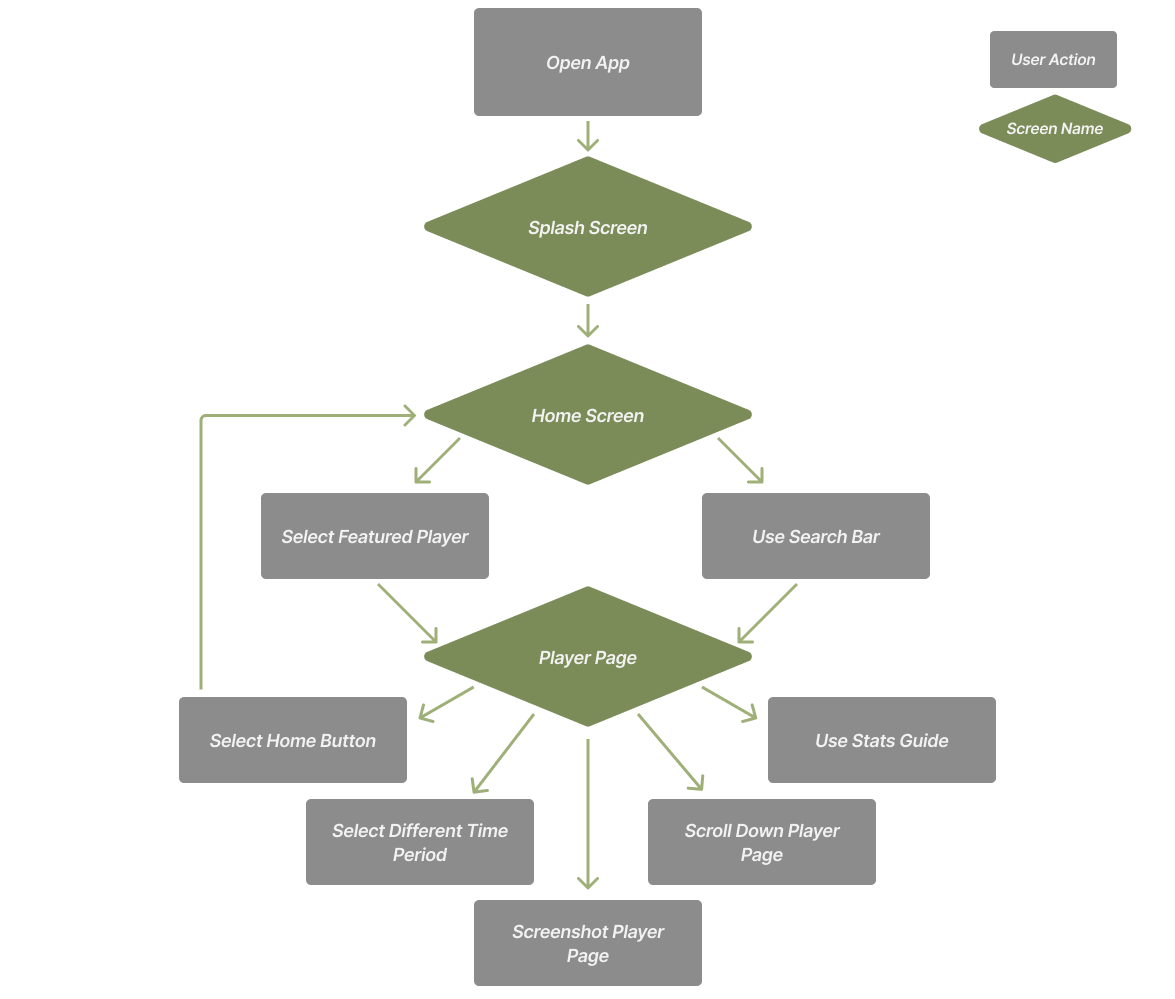
Flow Chart
A visual representation of our user's journey from opening MLB Radar Chart to accessing visually intuitive player pages, ensuring an efficient experience that aligns with the goals of Ryan, the persona.
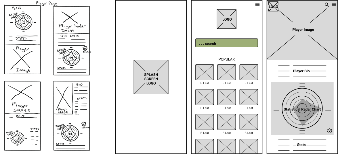
Low-Fidelity Mockups
Translating the problem statement and research into our initial visual blueprint focusing on core functionality and user interactions.
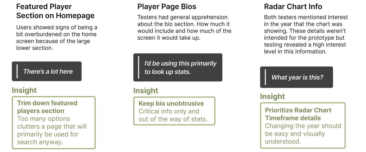
Testing and Insights
User testing sessions and interviews using the lo-fi prototype to reveal valuable insights and refine the user experience before high-fidelity designs are made.
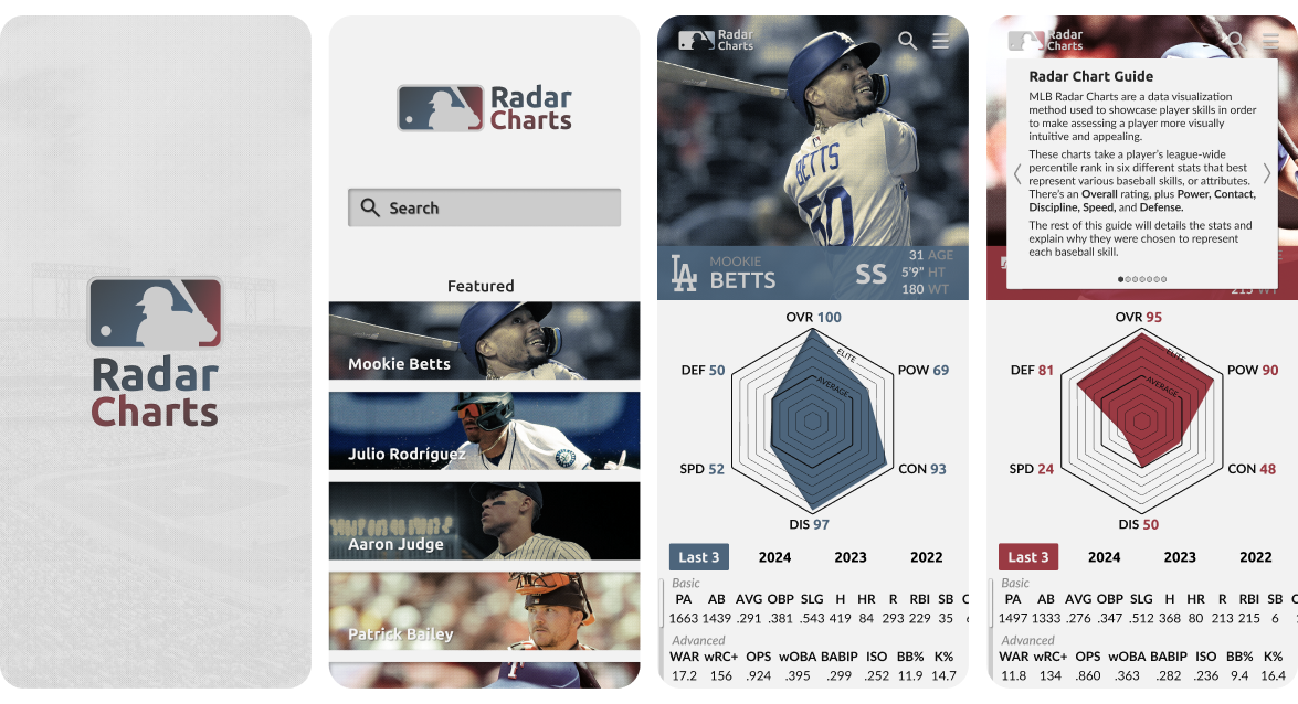
High-Fidelity Mockups
Polished visual representations showcasing MLB Radar Chart’s final look and feel, incorporating our refined user interface elements, and delivering a compelling and intuitive advanced baseball statistics experience to baseball fans.
Key Features
Featured Players
The Featured Players section on the home screen provides users quick access to trending players.
By limiting the homepage to only four players, while allowing further exploration through scrolling, we've struck a balance between offering popular player pages and avoiding overwhelming users with too many options — a design decision informed directly by user feedback during testing.
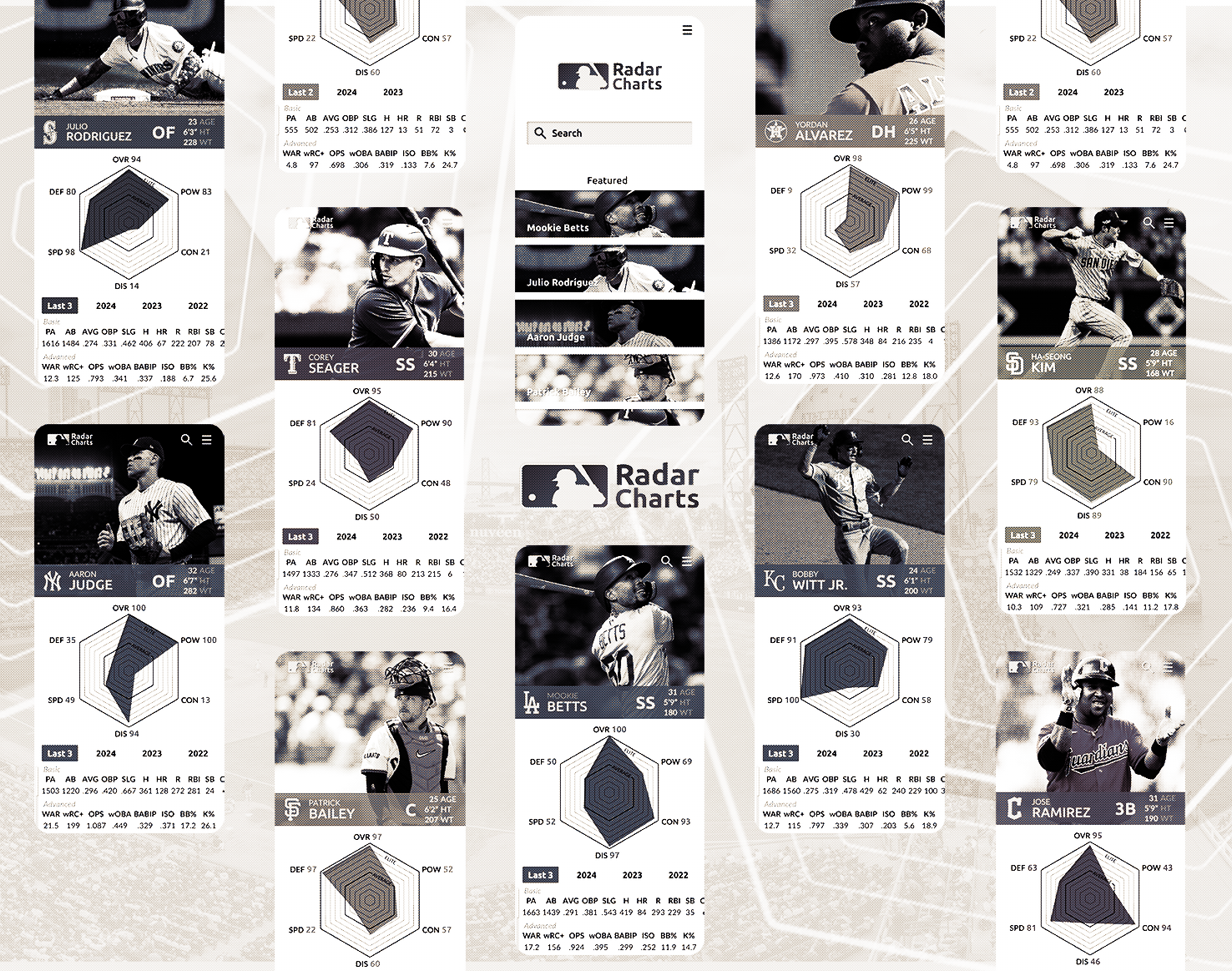
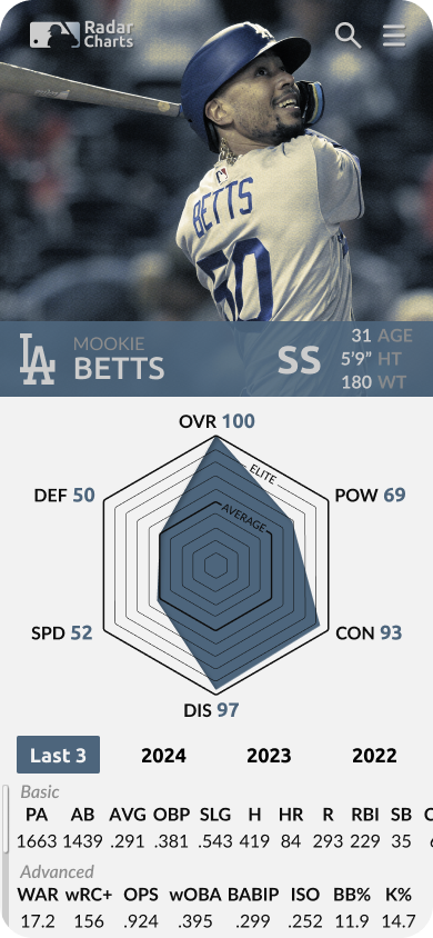
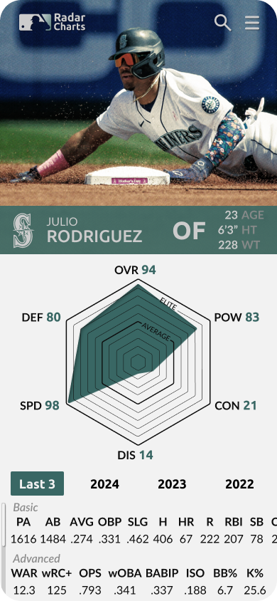
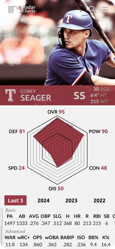
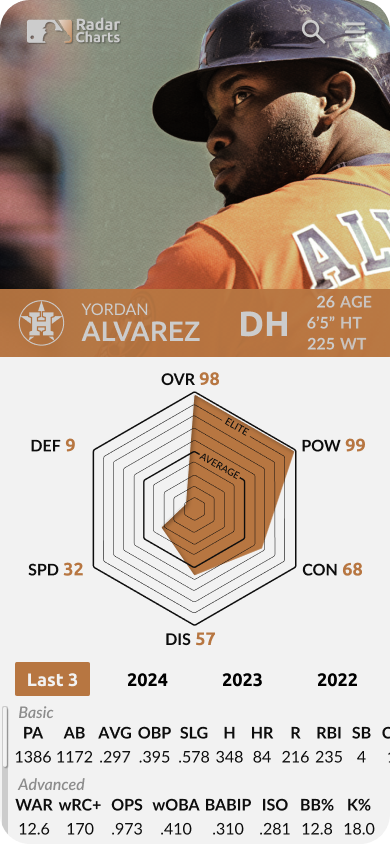
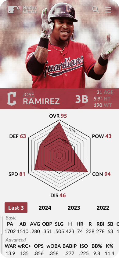
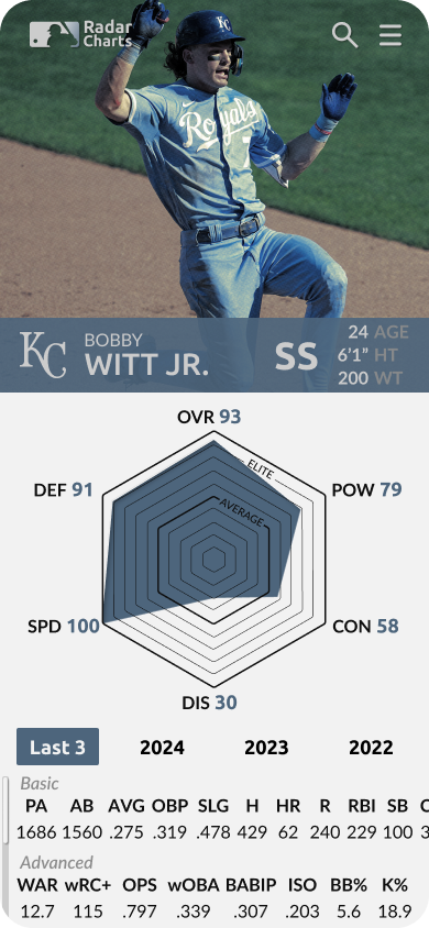
Percentile Ranks
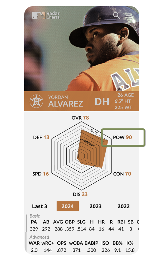
The Radar Chart at the center of each player page is an intuitive visual indicator for quickly assessing the skills of various baseball players. Each chart contains the player’s percentile ranks in six different advanced stats chosen to represent prominent baseball skills.
For example, Yordan Alvarez has a 90 Power rating because his Barrel%, an advanced metric chosen to represent a player’s Power skill, is in the 90th percentile among the sample size of MLB players.
Statistical Guide
The statistical guide is accessed by tapping on the radar chart, or the upper right menu icon. The user can even tap on a specific stat on the page to just straight to an explanation of that stat.
Research and testing showed that baseball fans are often unfulfilled in their desire to learn about a stat. This statistical guide is a user friendly solution that not only explains the stat being used in the radar chart, but also helps the user connect this stat with a baseball skill that they may be more familiar with, creating a connection that can help retain the information.
Radar Chart Adjustments
Adjusting the Radar Charts is as simple as selecting a different timeframe, which seamlessly adjusts the chart, as well as the other stats on the page, to represent the performance during the selected timeframe.
This design allows the selected timeframe to also act as a display, ensuring users, and even people viewing a screenshot, always know which season's data they're viewing.


Wrapping Up
The MLB Radar Charts project demonstrates the power of user-centered design in transforming complex data from the world of baseball into approachable and visually appealing information. Through iterative design, user testing, and sound design principles, MLB Radar Charts effectively addresses the needs of baseball enthusiasts for quick, intuitive player assessments.
MLB Radar Charts doesn't end here. Below is a working prototype that incorporates the insights and iterations discussed above. I invite you to explore the prototype, test its features, and share your thoughts. Your advice will help me enhance MLB Radar Charts and improve my UX/UI design skills for future projects.