
Minecraft Dungeons UX/UI Re-Design (Mock)
What is Minecraft Dungeons? A video game released in 2020 developed by Mojang Studios and Double Eleven. Minecraft Dungeons is a spin-off of the extremely popular Minecraft series and this particular game is an action-adventure role-playing game that is designed for ages 7+ and all skill levels.
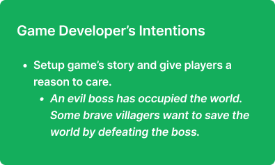
Project: Analyze the User Experience and Interface in Minecraft Dungeons through research and prototyping, in order to create an improved experience for the user. Create high-fidelity mockups that showcase the improved experience.
Timeframe: 10 weeks. This project was completed in a UX/UI Video Game class taught by Ivy Sang of Bungie.
Why Minecraft Dungeons? This project is in no way meant to discredit or disparage the original UX design of Minecraft Dungeons. This game was chosen because it represents a unique design challenge that I wanted to explore more - How do you create a game that’s approachable enough for kids, or inexperienced gamers, yet still contain the depth that more experienced players of this genre would expect?
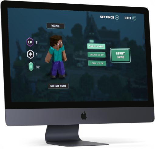
Home Screen UI Mockup

Gameplay UI Mockup
1. Analyzing the Player Journey
Analyzing the Player Journey helps identify issues between what the developer is intending for the player to experience and what the player is actually experiencing. I outlined the Player Journey for the initial gameplay loop of Minecraft Dungeons, and below is the Player Journey through the opening cutscene.
Opening Cutscene

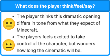
“The player feels excited to take control of the character, but wonders how long the cinematic will be.”


“The light-hearted nature of the franchise could show up earlier in the cinematic.”
2. Flow Chart
Analyzing a game’s flow chart allows for a better understanding of the screen-to-screen actions, options, and decisions that are presented to a player, and how this fit within the overall gameplay experience. I created a flow chart for the entire gameplay loop of Minecraft Dungeons, from the opening cinematic through level completion. The following is a small section of the flow chart showcasing the home screen, and later the gameplay screen.
Home Screen Flow Chart

Current Selection Screen (Homescreen)

Gameplay Screen Flow Chart

Current Gameplay Screen

3. Lo-Fi Wireframes (Version 1)
Creating lo-fidelity wireframes allows for rapid iteration and clarity of vital information gathered from the flow chart. I started by re-creating the game’s current wireframe to get a better understanding of the current layout before working on an improved version that would be used for testing.
Home Screen
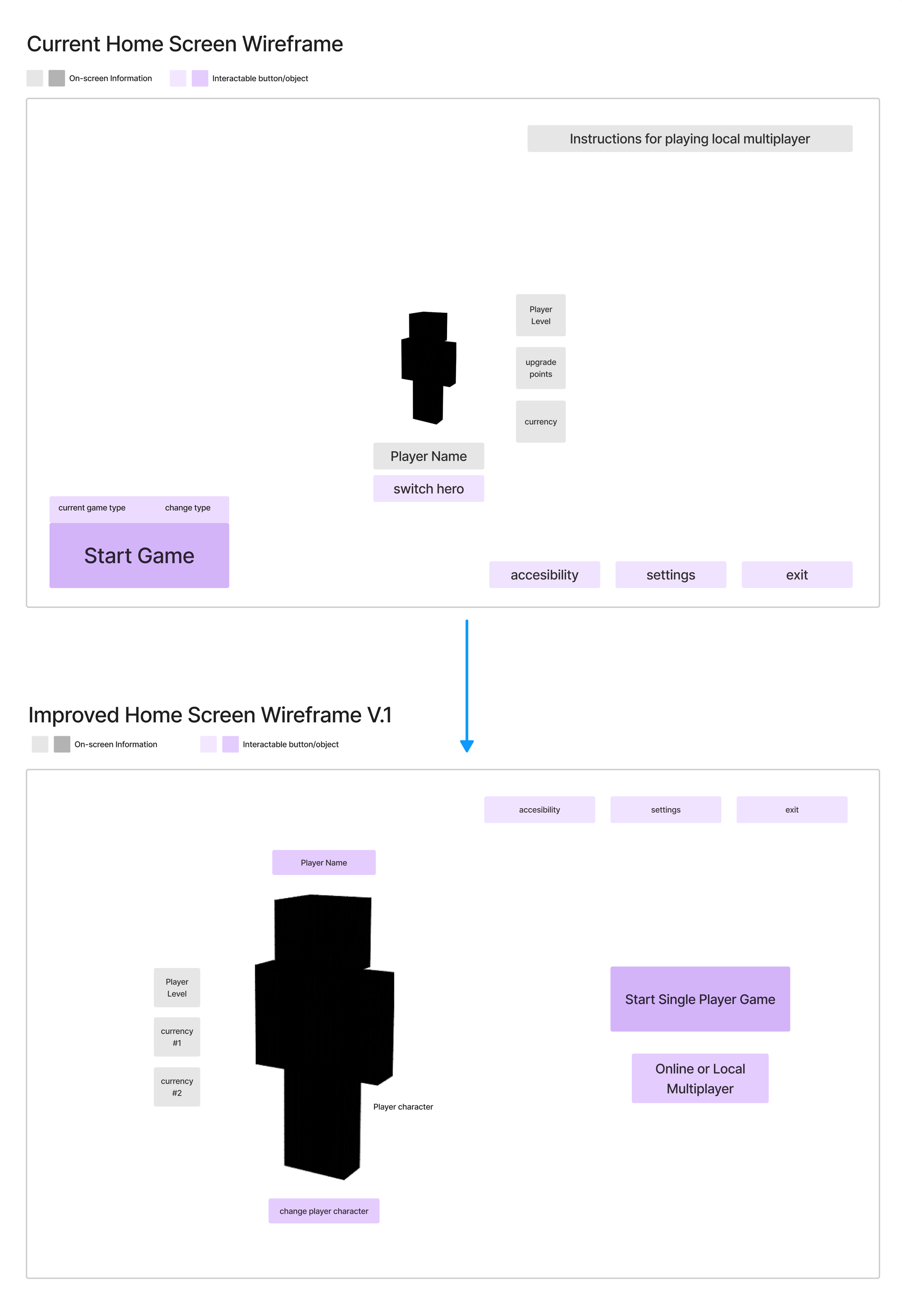
Improvements
Larger player character for building a stronger connection.
Moving “start game” options to the right to create a better left-to-right progression through the screen.
Giving a strong visual hierarchy to the currently selected mode.
Moved “options” panel to the upper right so that it is less easily missed.
Gameplay Screen
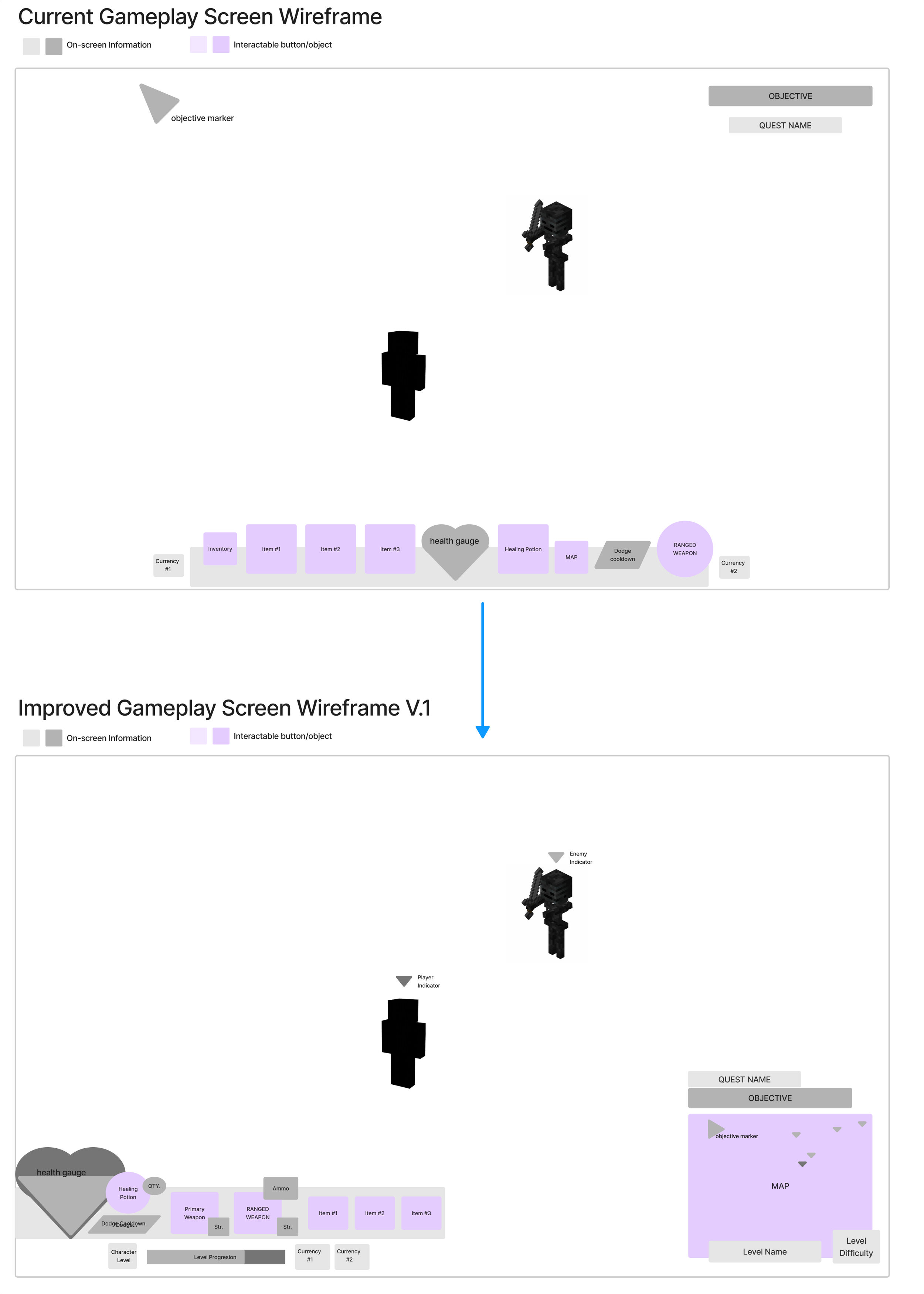
Improvements
Turned map overlay into minimap to make navigation more clear and to give players a single dedicated area for assistance with their quests.
Altered layout of items/weapons to take up less vital screen space.
Enemy indication is always on for any enemy on screen, as well as on the minimap.
4. Usability Testing
Evaluate wireframes, and design communication, with players of various experience levels to identify miscommunications and areas for further improvement.
Summary of Test Sessions

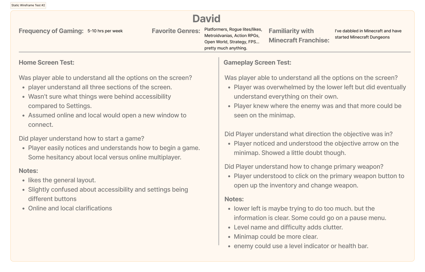
Research Results
Can players understand all the options on Home Screen without assistances? If no, why?
“Settings” and “Accessibility” means similar things to a lot of people.
Starting a local multiplayer game is not intuitive
Can players understand all the options on Gameplay Screen without assistance? If no, why?
Minimap could use some tweaking. The icons for enemies and players look similar to the waypoint.
Can players quickly start playing game from Home Screen?
There are some usability issues with how the game options are displayed. What happens when I click multiplayer or local? Those are two different options, so there should probably be two buttons.
How do players feel about the design on both screens?
There was too much of a learning curve to the minimap and the player inventory HUD on the gameplay screen.
5. Iterated Wireframes
Usability Testing revealed some strengths and issues with the wireframes. I turned the test results into actionable improvements that could further improve the wireframes.
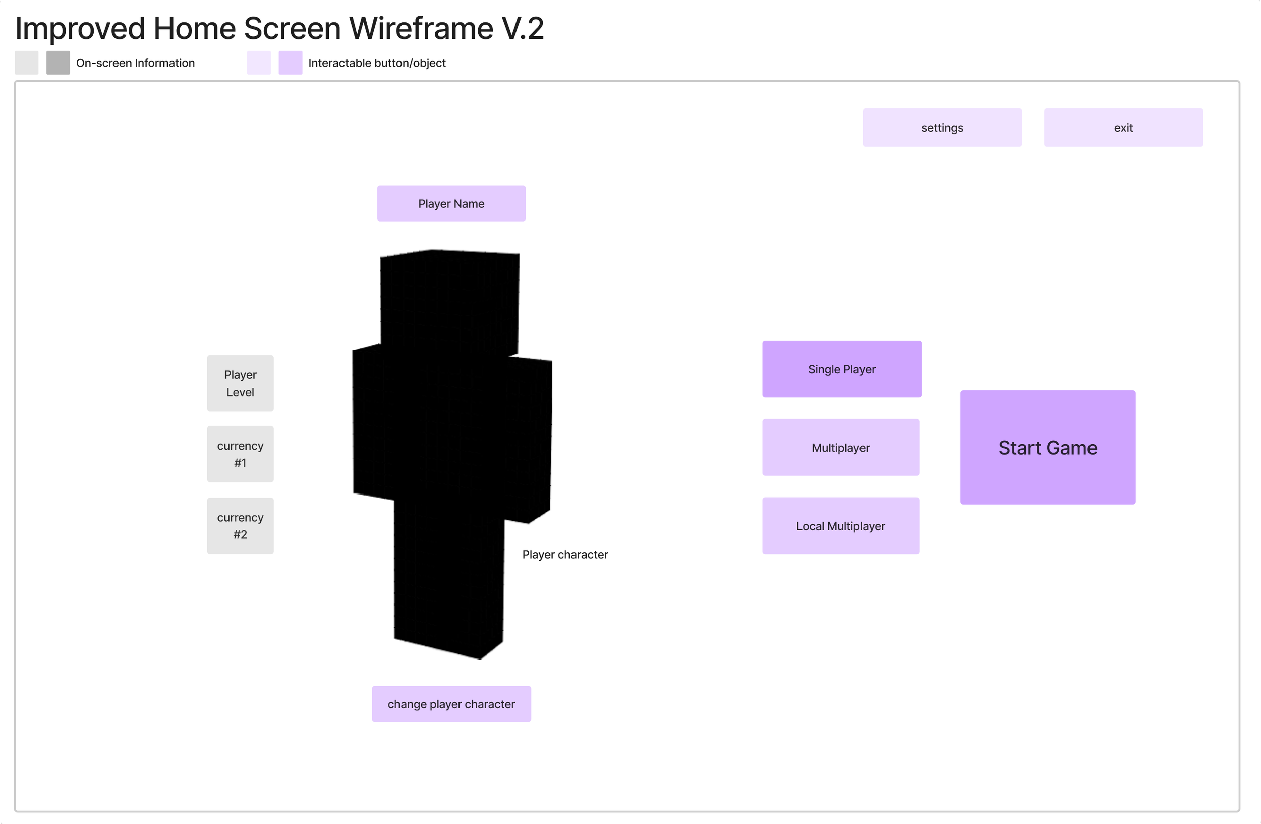
Improvements to Home Screen
Combined “Accessibility” and “Settings” buttons to alleviate confusion about what information is under accessibility compared to settings. It’s now all under “Settings.”
Vital accessibility features will automatically appear for the player before the home screen when they boot the game up for the first time.
Adjusted game mode layout to create three distinct buttons for the three game modes to make it clear how to choose each mode.
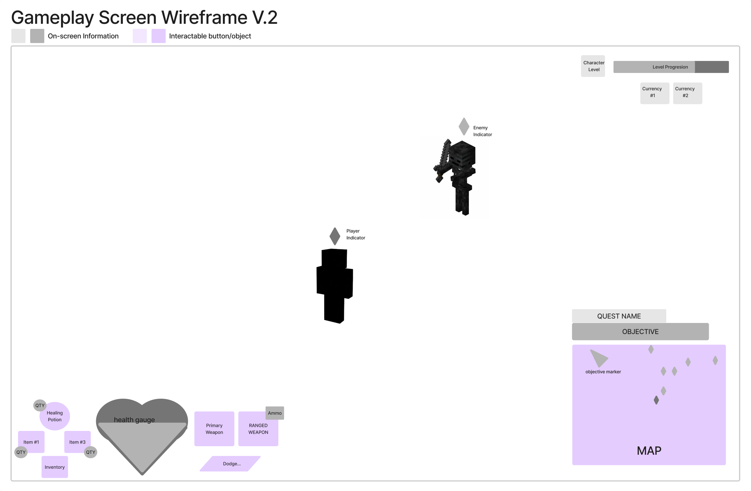
Improvements to Gameplay Screen
Adjusted player icon to create contrast between the objective marker icon.
Moved Player Progression/Currency info to the upper right to create a dedicated area for “big picture” progression.
Removed level name and difficulty from the map area, and they will be visible on the pause menu.
Rearranged/Unified actionable items in the lower left to create an area dedicated to moment-to-moment action abilities and information.
All consumable items being near each other and attacks near each other, separated by the player’s health. These locations correspond to button locations on the controller.


